The framing effect is one of the most powerful nudges in behavioural science. Change the way information is presented, and you change the decision that follows. When framing works, it can boost conversions, build trust, and make your offer feel instantly more compelling.
But there is a darker side too.
When the framing effect goes wrong, it can tank sales, destroy recognition, damage trust and turn loyal customers into critics, or worse, defectors, overnight.
This article looks at real examples of framing failures, why they happened, and what you can learn so you never repeat them on your product pages, ads or pricing tables.
What is the framing effect and why it’s risky in marketing
The framing effect describes how people make different decisions depending on whether information is presented as a gain or a loss. This comes from prospect theory, the work of Daniel Kahneman and Amos Tversky. They found that people feel the pain of losses more intensely than the pleasure of gains, and that consumers judge everything relative to a reference point rather than in absolute terms.
That reference point might be:
- A familiar design
- The old price
- The previous product size
- The original messaging
- What competitors charge
Changing the frame often resets the reference point. If customers interpret that change as a loss, things go south quickly.
Below are some of the clearest examples of the framing effect going wrong, along with the behavioural reasons behind each failure.
Case 1: Tropincana’s 2009 packaging redesign
In 2009, Tropicana redesigned the packaging of its Pure Premium line. They removed the iconic orange-with-a-straw image and replaced it with a clean, minimal glass of orange juice. Why? To present as a more “premium” brand.
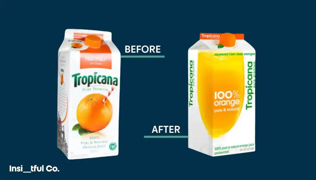
Consumers though? They hated it.
Not even 2 months had passed when sales reportedly fell by around 20 per cent, resulting in losses of roughly 30 million dollars. Tropicana reversed the redesign shortly after launch.
How the framing effect went wrong
- Identity loss: The orange-with-a-straw was not “just” an image. It framed the product as the real, familiar orange juice. Removing it broke recognition.
- Loss aversion: Consumers experienced the redesign as a loss. Their mental shortcut for “this is the one I buy” disappeared. Nothing was framed as a compensating gain.
- Category downgrade: The new design made Tropicana look generic, which essentially reframed a premium brand as an own-label alternative.
CRO takeaway
If your visuals act as recognition anchors, treat them like conversion assets, not decoration. Test recognition before making major visual shifts, or, ideally, avoid them altogether. A single design decision can change the perceived category of your offer.
Case 2: Shrinkflation
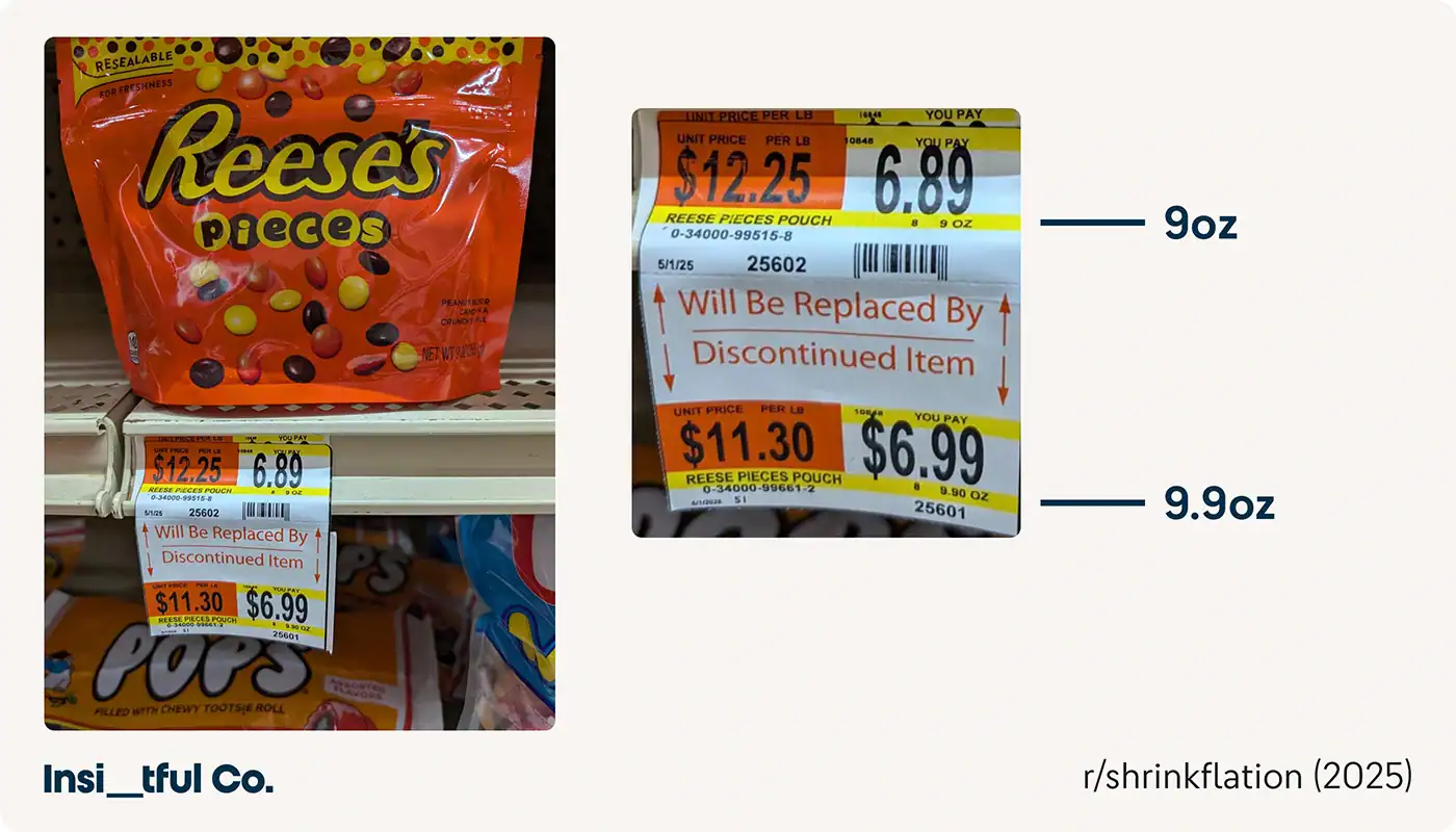
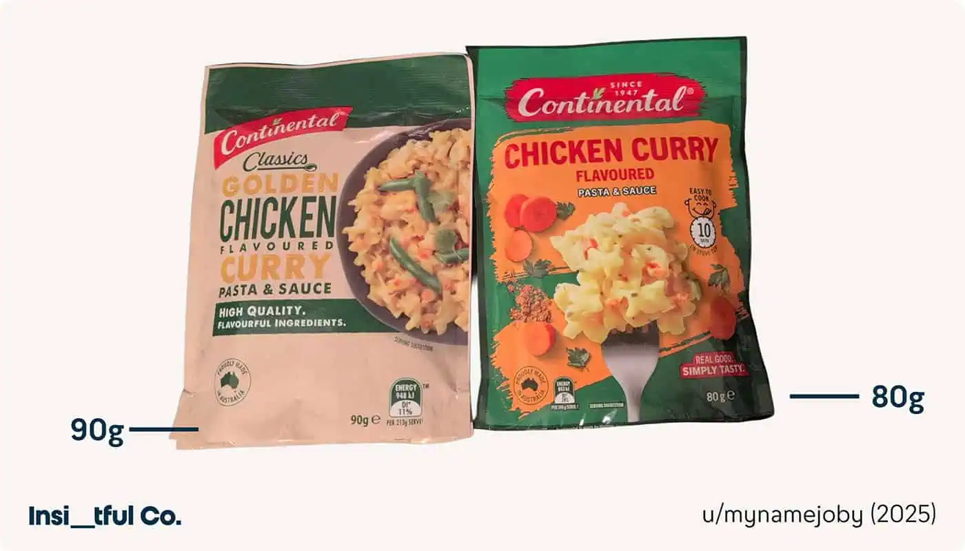
Shrinkflation is a textbook framing problem. The product gets smaller while the price stays roughly the same. Brands hope customers will not notice. Spoiler: they notice.
Public criticism of companies like PepsiCo, Coca-Cola, General Mills and others in 2024 and 2025 shows just how visible these changes have become.
How the framing goes wrong
- Old size becomes the anchor: Consumers compare the new pack to the previous one. Even a small reduction is judged as a loss.
- Moral reframing: Once the narrative becomes “this feels sneaky,” the issue stops being about value and becomes about fairness and trust.
- Social amplification: Viral side-by-side photos turn minor shrinkage into major PR crises.
CRO takeaway
Any change that looks like a loss should be framed around a clear gain or purpose. Silence invites suspicion. On ecommerce pages, be transparent with unit pricing when competitive. If you try to hide the maths, customers will do it for you.
Case 3: The Australian Governments anti-smoking fear frame
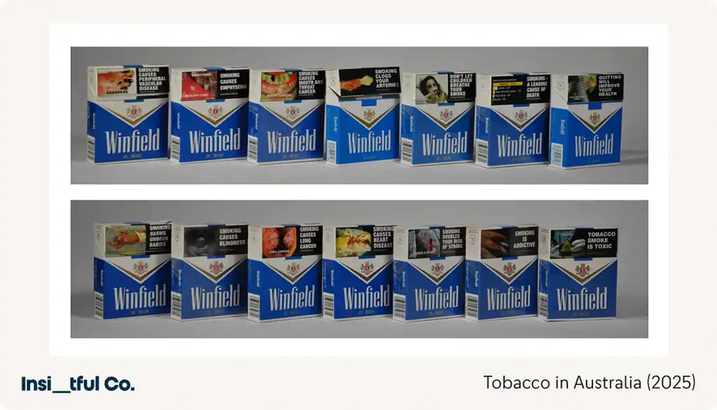
Australia ran one of the world’s most aggressive anti-smoking campaigns in the early 2000s, featuring graphic imagery and heavily loss-framed messaging. While the ads did increase Quitline calls in the short term, several follow-up studies found that younger and highly addicted smokers often reacted with defensive avoidance.
How the framing went wrong
- Cognitive overload: The message was catastrophically loss-framed. When the emotional cost of processing danger is too high, people prefer not to engage.
- Lack of perceived control: Loss frames work best when the audience feels the solution is achievable. Many smokers felt quitting was not.
- Psychological reactance: Overly coercive frames trigger pushback – “Don’t tell me what to do.”
Case 4: Abercrombie & Fitch and the “Cool Kids Only” exclusivity frame
In 2006, A&F CEO Mike Jeffries openly said the brand was “only for attractive, all-American kids” and “a lot of people don’t belong.” The exclusivity frame initially attracted its target audience, but it eventually blew up into backlash, negative press, declining sales and years of reputational repair.
How the framing went wrong
- Exclusivity reached the wrong audience: Exclusivity only works when shown to the audience that wants to belong. Jeffries put it in the press, which ensured the wrong people saw it.
- The frame became moral: Customers felt judged, not simply filtered out.
- The frame contradicted modern cultural values: As inclusivity became a mainstream expectation, the frame aged disastrously.
Bonus example: Yorkie’s “It’s not for girls”
One of my favourite examples of exclusivity framing from recent years has to be Yorkie’s “It’s not for girls” campaign, which, when launched in 2002 saw an immediate increase in sales.

Pairing the “It’s not for girls slogan” with phrases like “King size, not Queen size”, and “Not available in Pink” the campaign aimed to capture and boost sales with its male audience.
It worked.
Product sales boosted significantly, particularly among men who weren’t regular Yorkie consumers.
What I loved most about the campaign was that it had an interesting side effect: women bought more, too. Perhaps as an f-you to the brand’s message.
Overall, the campaign was a huge success; it positioned the chocolate bar as a bar for masculine men, saw a substantial increase in sales, brand visibility and also boosted sales from women.
CRO takeaway
While these two examples ultimately had different outcomes, both worked. And they worked well. It makes sense, we often want what we’re told we can’t have.
From a CRO perspective, however, I recommend using exclusivity framing with extreme caution. Use exclusivity to capture the audience that fits your brand, but do so ethically, avoiding alienating or offending anyone who sits outside it.
Where I’ve seen this work well is on membership sites – you need to know someone in the club to get in the club.
Case 5: Price framing that cheapens teh brand (Netflix & Uber)
Price framing is one of the easiest, most impactful nudges you can introduce to your store.
It’s also one of the easiest to mess up.
Done well, it makes value feel obvious. Done poorly, it makes a premium brand feel… Tesco Value (no offence Tesco).
Netflix & the password sharing crackdown
Netflix didn’t change or raise its prices directly at this moment, but it reframed the value of the service overnight.
For years, Netflix implicitly framed account sharing as normal – even encouraging it with their now infamous 2017 tweet, “Love is sharing a password”.
Then, in 2023, the company re-framed shared accounts as improper use, adding monthly surcharges for additional households.
The price didn’t change… the frame did.
And because consumers’ reference point was “shared access is included,” the new surcharge felt like a loss, even though the product remained identical.
How the framing went wrong
- They violated the existing mental contract: Customers felt Netflix suddenly changed the rules on something that had been culturally accepted, even encouraged, for years.
- The value frame broke: Instead of paying for “great entertainment,” users now felt they were paying to remove a penalty.
- Loss aversion hit hard: People reacted more strongly to the loss of what they had previously than to the actual (relative) price increase.
- The new frame felt punitive: Netflix accidentally moved from “world’s favourite streaming service” to “strict landlord checking who’s in the house.”
Uber & the “Upfront fares” perceived value collapse
Uber introduced upfront fares to improve transparency: You see the price before you ride.
In theory, it’s a great idea: Reducing cognitive load and increasing trust.
But by removing the familiar “meter-like” experience everyone knew, Uber unintentionally reframed rides as:
- more expensive
- less predictable
- less fair
Even when the prices were mathematically identical.
Customers began sharing screenshots of wildly inconsistent fares for identical routes.
Press coverage amplified the perception that Uber rides were no longer “affordable convenience” but instead “pricey, algorithmic guesswork.”
The frame shifted from value to uncertainty.
How the framing went wrong
- The anchor disappeared: With the old Uber you saw the fare build in real time. The reference point was “cost per minute/mile. With the reframe, a single number appears, with no story and no reference point – so customers lose trust and assume the worst.
- Context collapse: The lack of breakdown made people question how prices were calculated. Even fair prices feel unfair when framed unclearly.
- Social amplification: Screenshots of high fares reframed Uber publicly as overpriced, even if those cases were edge scenarios.
- Transparency paradox: Uber aimed for transparency, but without framing why a trip costs what it does, users felt the opposite.
CRO takeaway
If you’re changing pricing rules, even without changing the main price, anchor the new frame to a clear, positive gain.
Never rely on “they’ll just accept it.” Loss aversion guarantees they won’t. Explain the benefit, justify the shift, and maintain the emotional value story.
When in doubt, add context:
- show how price is composed
- anchor against a reference point
- use simple comparisons
Closing thoughts: What these framing failures teach us
Framing can lift conversions, strengthen value perception and make your brand easier to choose. But as the case studies show, it can also destroy sales, damage trust, and turn a reliable customer base into a sceptical one if used carelessly.
People don’t evaluate your product objectively. They assess it relative to the frame you create. That frame becomes the lens through which every price, feature and design choice is judged.
Across every failure, the same behavioural patterns repeat:
- Customers anchor on what they already know: When you shift the frame (packaging, pricing model, product size or emotional tone), customers will compare it to their previous reference point.
- Confusion kills conversions: Over half (56%) of customers abandon purchases when information isn’t clear (Forrester).
- Mixed frames break credibility: Premium design, with value copy. Daily-cost pricing on high-trust products. For everyone, but only if they now pay too. The psychology of these small contradictions is huge in teh mind of the customer.
- Losses hit harder than gains: If anything feels like a loss, you must show a compensating gain. Several brands on this list learned that the hard (and expensive) way.
- Test, test, and test some more: Every case study could have been prevented by running a controlled test with actual customers.
What this means for Ecommerce and CRO
Before changing pricing, visuals or messaging:
- Identify the customer’s current reference point.
- Make any gain explicit and unmissable.
- Keep your framing consistent across the funnel.
- Test the frame, not just the design.
Handled well, framing helps customers understand your value faster and feel more confident in choosing you. Handled poorly, your customer trust begins to evaporate and your clarity and conversions tumble.
If you want help avoiding your own “Tropicana Moment,” or you’d like insight into how to apply framing effectively across your product pages, book a FREE 30-minute discovery call and I’ll be happy to take a look at your store.